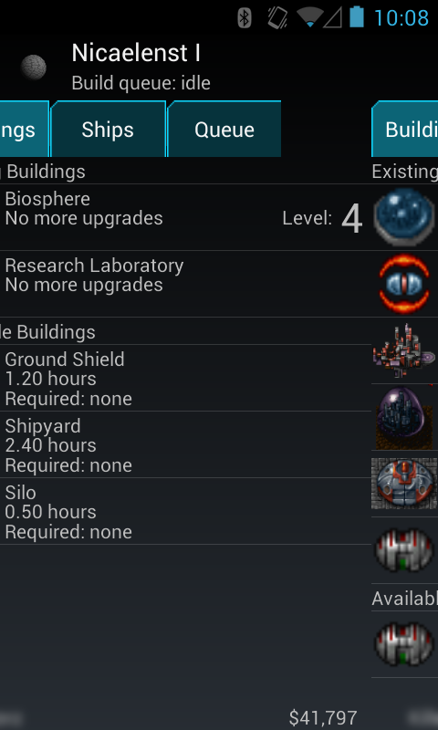
I added a seemingly fairly small change to UX on the Build menu. Now, instead of having to leave the build menu, select a different colony and click "Build" again, you can just swipe left-and-right to switch between your colonies in a given star. It's a little hard to see from a static screenshot, but I think this should give you an idea:
But after play-testing this for a while, it actually make a pretty huge difference to the speed at which I can bring a new star up to max. Some of the other changes I've made in the latest update should allow for more parallel requests to the server, which further boosts performance. I find now I can queue up builds as quick as I can swipe between the views, and the only thing that really slows me down is waiting for a notification from the server that a build has completed before starting the next upgrade. (The notifications use GCM which I have little control over, unfortunately).
On thing I have noticed is that the client can sometimes get out of sync with the server, especially if you're powering through the upgrade/accelerate cycle. In that case, you might notice that the UI says you're only up to level 3 but when you try to upgrade, you get a "already at max level" error. In this case, you can re-sync the view with the server by exiting out of the solar system view, back to the starfield and going back in again. It's a bit annoying, but I'll be working on these kinds of sync issues over time.